How to Choose a Bookshelf Color Palette
A seven-step way to pick a color palette for your shelves: start with what cannot change, choose neutrals and accents, fit the books in, and test it all on the floor.

At a glance
- Difficulty
- Easy
- Time
- About 45 to 90 minutes
- Best for
- Shelves that look random even when they are tidy
- Shelf type
- Freestanding bookcases, built-ins and cube units
What you need
- Your books
- The objects already on the shelves
- A cushion or throw from the room for reference
- A clear patch of floor or a table
- A phone camera
Shelves can be tidy, well spaced and still look random. The usual cause is color: a red spine here, a turquoise vase there, a brass frame, a black box, each one fine alone and none of them related to the next.
A bookshelf color palette fixes that by giving every object a reason to be there. It is a short list of colors, chosen in a set order, that you repeat across the whole unit. The steps below take an afternoon at most and need nothing new.
Step 1: List what cannot change
Your palette already has members before you pick anything. Write them down.
- The shelf itself. A white unit, a honey oak one and a black one each set a different stage. Wood counts as a color: warm, cool or reddish.
- The wall or back panel behind it. This shows through every gap, so it is one of the largest areas of color on the unit.
- The room. Note the two or three strongest colors nearby: the sofa, the rug, the curtains, a large piece of art.
Everything you add has to get along with this list. Start here and most later decisions become easy.
Step 2: Choose one or two neutrals for the bulk
Neutrals carry most of the objects: cream, white, sand, warm gray, charcoal, black, natural fibers. Pick one or two and let them cover the majority of your ceramics, boxes, baskets and frames.
Match their temperature to the fixed list. Cream and sand sit well on warm wood; crisp white and cool gray suit a white or gray unit. If you find you want to stop at this step, a fully neutral shelf built on texture is a complete look in its own right.
Step 3: Add one or two accent colors
An accent is the color you notice. Take it from the room where you can, such as the green in a cushion or the rust in a rug, so the bookcase looks like it belongs to the space around it.
If you want two accents, choose them in relation to each other. Neighbors on the color wheel, such as blue and green, feel calm together. Opposites, such as deep green and terracotta, give more energy. Keep one accent clearly in the lead and the other as a smaller echo.
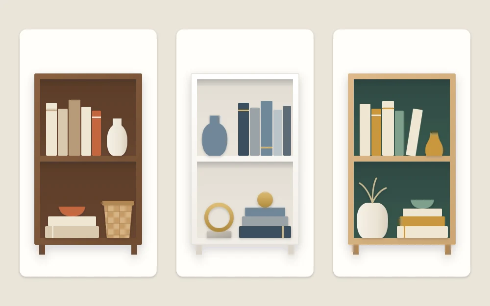
Step 4: Count metals and wood as colors
Brass is a warm yellow. Chrome and silver are cool grays. Black iron is black. A walnut box is a dark brown, and a pale ash bowl is close to cream. Each one takes a slot in the palette.
That means a unit with brass frames, a copper pot and a chrome lamp already has three colors before a single book goes in. Choose one metal to lead, allow a second in a small amount if you like, and treat wooden objects as part of your neutral group.
Step 5: Decide what the books will do
Book spines are the largest area of color on most shelves, so they can either support the palette or drown it. You have several options, from gentle to firm.
- Group by tone. Gather spines that already match the palette on the shelves at eye level. Pale and neutral spines act as base; a run of green or blue spines can be one of your accent repeats.
- Move the loudest ones. A few bright spines that fight everything can go to the lowest shelf, behind a basket line, or to a bookcase in another room.
- Stack them flat. Laid on their sides under an object, bright books show less spine and look deliberate.
- Turn or uncover. Some hardcovers are a quiet cloth color under a busy dust jacket. Others can face cover-out if the cover suits the palette better than the spine.
Sorting the whole collection into a spectrum is a different project with its own trade-offs; see the guide to arranging books by color if that appeals.
Step 6: Repeat each accent at least three times
One green vase is an odd one out. Three green things, spread across the unit, are a decision. Aim for at least three appearances of each accent, in different sizes and on different shelves: a large vase low on the left, a small bowl in the middle right, a run of green spines near the top.
Trace the repeats with your finger. They should form a loose triangle or zigzag, not a straight line or a cluster in one corner. Where each repeat sits is as important as its color, and the piece on balancing a bookshelf visually covers that placement in detail.
Tip
As a loose guide, let neutrals and books take most of what you see, the lead accent a modest share and the second accent a few small touches. Treat this as a starting proportion, not a formula.
Step 7: Test it on the floor
Before anything goes back on the shelves, lay every candidate object on the floor or a table in front of the unit, with a few of the books that will stay at eye level.
- Stand back and look for the thing your eye lands on first. If it is not in the palette, take it out.
- Remove anything that makes its neighbors look dirty or dull. A cool white beside warm cream is a common culprit.
- Check that each accent still appears at least three times after the removals.
- Take a quick phone picture and look at it small. Clashes show up faster on a screen.
What is left is your palette in physical form. Objects that did not make it are not wasted: they may suit another room or a later seasonal change.
If the result feels too quiet
A palette is a limit, not a ban on color. If the finished unit looks flat, deepen one accent instead of adding a new one: swap a pale green piece for a darker green, or bring in one larger object in the lead color. If you want color to be the whole point, a deliberately bright, colorful bookshelf uses the same repeat-three-times logic with more accents and stronger contrast.
Frequently asked questions
How many colors should a bookshelf have?
A workable palette is one or two neutrals plus one or two accents, with metals and wood tones counted among them. That usually means three to five colors in total. Fewer looks calmer and more formal; more can work if each color is repeated several times across the unit.
Do all the books have to match the palette?
No. Books you read regularly should stay easy to reach. Concentrate the best-matching spines on the shelves at eye level, and let mixed colors live on lower shelves or in flat stacks under objects, where they show less and still look intentional.
Should the bookshelf palette match the room exactly?
It should relate to the room without copying it. Borrowing one or two colors from cushions, a rug or artwork is enough to tie the shelves in. A slightly darker or lighter version of a room color often looks more natural than an exact match.