Neutral Bookshelf Styling: Texture, Tone and Quiet Contrast
Why calm cream-and-wood shelves fall flat and how to fix them with a full tonal range, mixed textures, strong shapes, tone-sorted books and one touch of green.
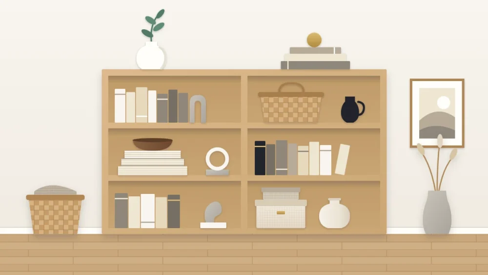
A neutral bookshelf promises calm: cream, sand, pale wood, nothing shouting. Then you step back and it looks like a single beige rectangle, pleasant enough and completely forgettable.
The cause is nearly always the same. Color normally does the job of separating one thing from the next, and once you take it away, something else has to do that job. On a neutral shelf, tone, texture and shape take over. The symptoms below are the common ways a quiet shelf goes flat, each with its fix.
Symptom: everything melts into one pale block
The cause: the neutrals are all the same lightness. Cream books beside an ivory vase beside a white bowl on an off-white shelf leave the eye nothing to hold.
The fix: use the whole tonal range, from white through sand and warm gray to a little near-black. Think of it as a scale with five steps and make sure each step appears somewhere.
- White and cream for the lightest objects and many of the books.
- Sand, oatmeal and pale wood for the middle.
- Tan, mushroom or mid gray for depth.
- Near-black in small doses: a slim jug, a picture frame, two or three dark spines.
The dark note matters most. It is what gives a pale shelf definition, the way a pencil outline sharpens a wash of watercolor. Dark pieces look visually heavy, so two or three small ones spread across the unit do more than a single large one.
Symptom: it looks fine from afar and dull up close
The cause: every surface has the same finish, usually smooth and slightly glossy.
The fix: mix at least four textures across the unit, and put contrasting ones side by side.
- Matte ceramic
- Wood with visible grain
- Woven fiber, such as a seagrass or rattan basket
- Linen- or cloth-covered books
- Stone or a stone-look piece
- A small touch of metal, such as aged brass or blackened steel
Rough next to smooth is the pairing to aim for: a woven basket beside a glazed bowl, a chalky vase on a stack of cloth-bound books. Two pieces in the same color become clearly different objects the moment their surfaces differ.
Symptom: the objects blur into each other
The cause: similar shapes at similar heights. Three medium rounded vases in cream are, visually, one lump.
The fix: since color is quiet, make shape loud. Set a tall narrow piece against a low wide one, a sphere against a block, a straight line against a curve. Vary height sharply within each group so every silhouette shows against the back of the shelf.
A good test is to imagine the shelf as a black cutout. If the outline is interesting, the neutral version will be too. For pairings that work, see the guide to styling vases and bowls on shelves.
Symptom: the books fight the scheme
The cause: most books are not neutral, and a handful of bright spines can undo a careful palette.
The fix: you have three options, and they can be combined.
- Group by tone. Gather the white, cream, gray, tan and black spines onto the most visible shelves and arrange each row from light to dark.
- Move the brights. Shelve colorful spines on the lowest shelf, in baskets, or on another bookcase entirely.
- Turn a few stacks. Lay some books flat with the page edges facing out, so the stack reads as one pale, softly striped block.
Good to know
Books with their page edges out are hard to identify. Keep this to a few stacks of books you rarely reach for, and leave anything you read or consult often with its spine showing.
Symptom: calm has become lifeless
The cause: everything on the shelf is a made object in a quiet color, and nothing looks alive.
The fix: add one living green. A single leafy stem in a vase, or one small plant, is enough. Green behaves almost like a neutral beside wood and cream, and its irregular outline loosens all the straight lines around it.
Keep it to one or two. More than that and the shelf becomes a green scheme. Any pot needs a saucer or cachepot so water never reaches the books.
Symptom: something feels slightly off and you cannot name it
The cause: warm and cool neutrals are mixed. A blue-gray vase beside a yellow-cream bowl can make one look dirty and the other look cold.
The fix: decide which side you are on and stay there.
- Warm neutrals lean toward yellow or red: cream, ivory, sand, oatmeal, tan, warm gray, honey and oak tones.
- Cool neutrals lean toward blue: bright white, pale gray, slate, ash wood, concrete tones.
Let the shelf and the room decide. An oak or walnut bookcase is already warm, so warm neutrals will settle into it; a white or gray unit can go either way. To check a doubtful object, hold it against a sheet of plain white paper in daylight, and its undertone will show. The guide to building a bookshelf color palette goes further into choosing a base tone and accents.
How quiet do you want it?
Once tone, texture and shape are doing their work, the remaining choice is quantity. A neutral shelf can be generously filled and still feel restful, because nothing on it competes.
If you would prefer to go further and reduce the number of things as well as the number of colors, that is a different exercise with its own logic, set out in the guide to minimal bookshelf styling. Neutral is about palette; minimal is about how much you keep. You can have either without the other.
Frequently asked questions
How do you keep a neutral bookshelf from looking boring?
Rely on contrast that is not color. Use tones from white to near-black, combine rough and smooth textures such as woven fiber and matte ceramic, and choose objects with clearly different heights and outlines so each one stands apart.
Should books face backward on a neutral shelf?
Turning a few flat stacks so the page edges face out creates a soft pale block, but it makes those books hard to identify. Limit it to books you rarely need, and keep the ones you use often with their spines visible.
Can you mix warm and cool neutrals on one bookshelf?
It tends to look calmer when one side clearly leads. Warm creams and sands suit oak and walnut shelves, while bright whites and cool grays suit white or gray units. A small amount of the opposite temperature is fine if it is clearly an accent.